Each year the Buy Art Fair comes to Manchester. It's a welcome addition to the arts event calendar and an opportunity for normal folk like me purchase art and generally see what independent British galleries have to offer.
After a few hours of Sunday morning pottering and general procrastination off I went in the direction of Spinningfields. Minus the little mix up of heading to the fairs past two sites, I soon found its new spot on Hardman Boulevard and was heading inside the sun filled white marquee. A security guard stopped and asked what I was doing as I was entering through the entrance, despite it being marked 'entrance' and other people going in through the door. Then the rather concerned way another lady looked at me and asked 'are you alright?' made me wonder if I was having a nose bleed I was unaware of, or had mascara streaming all down my face! Maybe I had a particularly gormless expression on my face which unsettled them!
.JPG)
Entrance hiccups aside, I had soon registered and was off, heading straight for the Art Republic stand which is a favourite of mine since visiting the gallery space in Brighton a few years ago and later receiving a framed print from Liam as a gift.
This year in particular there seemed to be far more pieces that I was tempted by. I usually just go to window shop, generally admire the work and look for potential artists for future features, but I soon found myself eyeing up potential purchases before reminding myself of the fact that we are currently trying to fork out for our wedding!
First to leave me lingering on the ArtDog London stand a little too long were these fun screen printed animals dressed as fashionable gents by an artist called Kelly Eggleston.

They reminded me of Charlotte Cory's work, who I absolutely love. She superimposes images of taxidermy animals onto Victorian portrait photographs to create characterful little fellows.(Charlotte Cory, Gentleman Badger, below)

Several of the stands had those interactive Smartphone icons for you to scan to find out more information about the pieces and their artists. With a bit of assistance from a nice lady on the DegreeArt stand I had downloaded a QR Reader and was happily collecting a list of pieces I liked on my iPhone...


I chatted to a nice chap on the Antlers stand; a nomadic gallery based in Bristol (www.antlersgallery.com) who had some superb illustrations by Rebecca Hiscocks (beckihiscocks.blogspot.co.uk) on display.
.JPG)
They had a macabre anatomical feel to them whilst being delicately beautiful, with soft pinks running through them to create a sensual feminine quality juxtaposed with the deathly subject matter of skulls, hearts and skeletons.

I was captivated by a diptych of photographs by Charles Emerson (charlesemerson.co.uk) and stood there for some time staring at them and trying to figure out how they had been done (a flaw that comes with being a curious fellow photographer - though I'm ridiculously inferior in talent compared with this guy) One of them, in the image below, with a muted dusky peach and grey palette looked as though it had been set on fire and was delicately smoking away. The guy on the stand explained to me the series were done by suspending flowers in water and ink. They had a deeply fragile quality to them with the rose also being a symbol of mortality. Again like Sophie Derrick's work, I liked the way that painting and photography had been fused together.
.JPG)
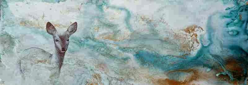
Someone whose work had a similarly delicate quality that I absolutely loved (and was very tempted to make a purchase of) was Beth Nicholas, (www.beth-nicholas.com) whose work was on display on the Curious Duke Stand. Some were more abstract paintings of water, with a beautiful fluid quality. Others like the one below were adorned with deer and birds, and each furnished with gold leaf.
These screen prints by Clare Johnson also caught my eye. She likes to indulge in 'urban hiking' and sources her inspiration from the urban, industrial landscape and vintage postcards (www.clarejohnson.co.uk)
.JPG)
Exhibiting alongside her was Orson Kartt. I wanted his Much Ado About Nothing mixed media book art print very much! and there were several others my eye was drawn to in the collection. (www.orsonkartt.com)


.JPG)
I also bumped into Kate Kelly, Pretty Nostalgic Book Group member and fabulously creative owner of Kaper (www.kaperonline.com) who we have featured in the magazine. She was manning the Manchester Craft Centre stand which was looking fantastic and crammed full of goodies from the makers housed in its studios. (www.craftanddesign.com)
Feeling a little naughty after making a top secret purchase on my way out the door, I aborted all plans to visit the Manchester Food and Drink festival for the sake of my bank balance!
No comments:
Post a Comment